Note: This is the 3rd post in a 5-part series tracing the steps we went through to redesign the Skai logo leading up to our new brand launch on the 10th of February. In case you missed it, catch up on Part 1 and Part 2.
Having immersed myself in the Skai brand for the previous 18 months leading up to K8 in September, a vision of our new logo had been simmering in the background of my mind for some time. It was just beyond my mental reach, still blurry around the edges, and, wanting to give it due headspace, I refused to let it surface fully until the right time.
Now, addressing it head-on, some quick and early brainstorms with the rest of the creative team proved that I wasn’t alone. Better yet, as it turned out, we were all on the same page. This seemed promising.
Still, experience warned not to start there. It was imperative to resist the urge to focus purely on taste or instincts — our design needed to communicate, first and foremost.
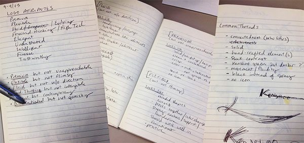
Putting pen to paper, we itemized the various attributes we were aiming for our new logo to express, vetting them with key personnel throughout the rest of the org. It was critical to stay true to our brand persona, and to really zero in so these qualities would resonate deeply with Skai.
We didn’t worry too much about polish in syntax or wordsmithing — this wasn’t about optics. The point was simply to find a plainspeak true North to guide the tough design decisions ahead.

Our final list including the following:
- Adventure, but with purpose
- Unique, but not gimmicky
- Premium, but approachable
- Forward-thinking, but grounded
- Integrity, but not humorless
- Fluid, but not aimless
Next, it was time to build a visual language. What would/should/did all of that look like? How might we convey, for example, both adventure and integrity in the same glance?
Revisiting the whiteboard, we mapped aesthetic qualities to each of our attributes. Among others, the initial list included words and phrases like:
- Elegance (Premium)
- Hand-drawn (Unique)
- A touch of the unexpected (Adventure)
- Momentum (Fluid)
Aiming for something cohesive, we sought the commonalities between attributes and their aesthetic expressions. Where we found crossover, clearly we were on to something: good, solid direction to inform the artistic exercise to come.
It took coffee and conversation, but there was a method to the madness. And we came away with highly specific visual cues that each spoke to at least two of the traits intended for representation.
It was decided that in some measure, we’d be employing the following in our new logo:
- Painterly elements/brush strokes (because digital marketing is an art and a science; adventure, unique, fluid)
- Literal forward-leaning slant (because we’re leaning in; forward thinking, adventure, unique, fluid)
- Sense of connectedness between elements (conveying our holistic approach, with infinity on the brain; adventure, unique, premium, fluid, forward thinking)
- A classic typeface (nothing too cute or too serious, avoiding shelf life; premium, integrity, forward thinking)
- Smart and deliberate contrast (between colors, stroke widths, and styles to create positive tension and visual interest; adventure, unique, premium, forward-thinking)
Armed and confident, it was time to get our hands dirty. Any graphic designer can tell you that much of the actual design process is instinctual and organic—largely unpredictable until you hit the drawing board and begin converting concepts into pixels. One idea sparks another, and the best laid plans are scrapped in seconds when they turn out to look . . . wrong.
Getting it right can be a thrill and a joyride or a hard-won labor labor of love. It can take minutes or months.
At Skai, our standards are high, we’re our own harshest critics, and hey, we’ve got clients to tend to!
It took months.
Tomorrow, I’ll show you some of the concepts we cycled through.


