Note: This post is part of a 3-week blog series exploring the roots of Infinite OptimizationTM. To stay in the loop as each new post is published, please subscribe via email using the box on your right.
Welcome back! We’re traversing the path to Infinite Optimization and, in this section, we’re sharing how we arrived at the infinity loop design.
The goal was to create a visual representation of the Skai product offering. The first step, as discussed in yesterday’s post, was to update the individual components of our solution to be more in line with our latest brand persona and identity guidelines.
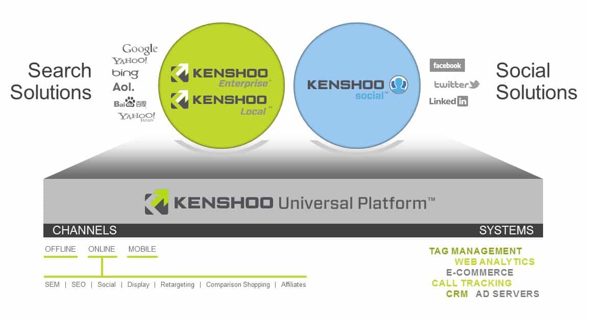
From there, we experimented a bit with shapes, font, and gradients to make the key elements pop off the page a bit more. Below is where we landed:

After shopping this around internally, we got some really good feedback from our sales team. This depiction put too much emphasis on the platform and not enough on the individual products.
Fixing this imbalance was important because we don’t actually sell the Skai Universal Platform. Rather, the platform powers our search and social solutions which are the systems our clients license and use to optimize their programs.
Around this time, we also began toying with the idea of rebranding Skai Enterprise.
As Skai Local expanded to incorporate management and syndication of page place listings through the CityGrid network, we felt it was important to break Skai Local out of our “Search Solutions” and give it an identity of its own.
That left Skai Enterprise as our sole dedicated SEM solution, so we decided to just call it was it is – Skai Search.
We also wanted to reframe our marketecture around the key client issues we’re solving. (You can catch up on those in part 2a, b, c, and d.)
Come back tomorrow to see how we updated the graphic to incorporate these ideas.
