Note: This is the 4th post in a 5-part series tracing the steps we went through to redesign the Skai logo leading up to our new brand launch on the 10th of February. In case you missed it, catch up on Part 1, Part 2 and Part 3.
There’s a common misconception that people are either creative or they’re not. I hear a lot of “but I’m not a creative type”, as if it’s a binary thing, either-or. In large organizations, the effect of this mindset is that design and creative are often produced in a bit of a silo, unexposed to broader influence and sheltered from varying points of view.
Actually, pop science has shown that creativity is a skill that can be honed and nurtured, or ignored. While my design team at Skai is small in numbers, they are fierce, and I’m fortunate to be surrounded by a plethora of creative minds companywide. Happily, most are uninhibited by right- or left-brain labels, and eagerly contribute to the creative process regardless of their formal job titles.
There are few experiences as gratifying as teamwork that actually works, and our new logo is the result of just that. From leadership to techies to sales, representatives from every discipline at Skai weighed in.
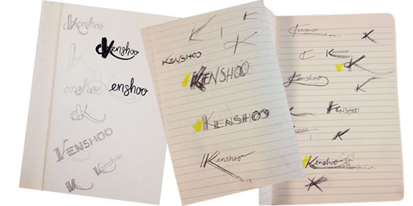
It all began with numerous freehand sketches—rustic and unrefined—in the margins of our notebooks. Some were mindlessly doodled during meetings, others sketched during brief power brainstorms, with the best ideas messily earmarked or highlighted to revisit later.

With an open mind, previously mentioned fierce designers Savannah Million and Liz Kohrman began the painstaking charge of digitally rendering the concepts most compelling to us, adding depth and detail, refining and iterating in any spare moments they could find.
Settling on a general direction, we played with angles and color, adjusting seemingly minute details and finding they made a huge difference. Aaron’s obsessive critical eye for detail (referred to around here as 3e, short for “third eye”!) and voice of reason kept us centered as we struggled to stay objective and emotionally unattached to our work. After all, design isn’t art for art’s sake—it’s problem-solving.
Even when we thought we’d done it, having checked off all of our attribute criteria, there were problems to solve. In socializing our working favorite with the management team, concerns were raised. Was it potentially a bit hard to read? Might it be too “soft” for a bold and bullish organization like ours? Would the color scheme be practical? Was there something of a disconnect between the K we were leaning towards and the “enshoo” that followed?
The UX team had questions about the design maintaining its integrity at smaller scale, and along with Product Marketing and Marketing, worried about legibility, too—giving us serious pause.
We iterated, recirculated, solicited feedback, weighed it, adjusted and tweaked. We changed course altogether, explored new directions, and came back to where we started.
It began to feel like we were spinning our wheels…so close to getting it right, yet not quite there, and time ticking away at warp speed. Every design compromise seemed to come with a tradeoff that was hard to live with: movement for the sake of readability, elegance for the sake of scalability.
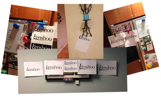
We (read: I) set logo-related “intentions” in yoga classes and manically tested legibility by interviewing strangers in grocery stores. We hung options on our office walls and home refrigerators, weighing our under-caffeinated morning reactions against what we perceived midday or, say, on a boat, a drink or two in, at our holiday party.

There were eureka moments and face palms, and lots and lots of opinions.
It was a tough nut to crack, toeing the line of the visual interest we were after and K.I.S.S. legibility.
Tomorrow, I’ll talk about where we landed.


